Thematic analyses allow you to present visually any information stored in a column of your data, via size color variation, size variation or else. You can create multiple thematic analyses in one or multiple slides to combine and create complex data visualization. Thematic analyses are saved in your map slides.
Add a new thematic analysis
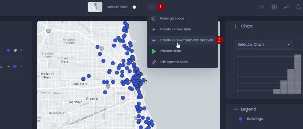
To add a new thematic analysis, click on the three dots of the slide action menu in the top bar of your map (1), then click “Create a new thematic analysis” (2).
This will open the thematic analysis creation dialogue, where you can :
- Choose a layer: this is the layer your thematic analysis will be created on. The available layers are the layers you’ve added to your map.
- Select column(s): this is the information which will be represented visually on the map. You can select multiple numeric columns.
- Choose a representation: choose how you want to represent the column information. The type of representation depends on the type of your layer (polygon, polyline, points) and the type of the selected column(s) (numeric or string). See the section on types of thematic analysis below.
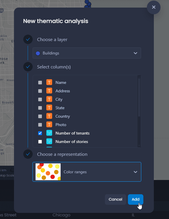
Click on “Add” once you have selected your layer, column(s) and representation. This will create the thematic analysis and add it to your map. You will see the effect of the thematic analysis in your map and in the legend, where you can customize it. A chart is also added automatically in the chart panel to reflect your thematic analysis. The column(s) used in the thematic analysis are also added to the table view and in the data tip.
You can also add a thematic analysis from the properties of a layer:
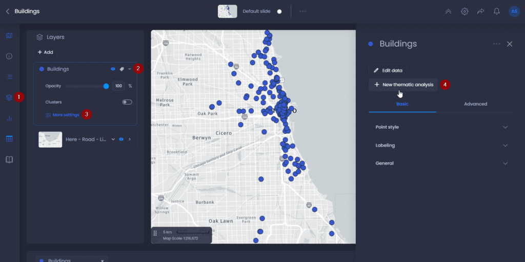
In this case the layer will be pre-selected in the thematic analysis creation dialogue.
Types of thematic analyses
Depending on the data type of the data columns, the type of representation for thematic analyses changes:
- Numeric: color graduation, size graduation, pattern graduation for lines and polygon
- String, Date/Time: color categories, shape categories, pattern categories for lines and polygons.
Map features
The density of a point layer can be represented using a Heat map. It is also possible to represent the density of points using Clustering.
| Thematic Analysis Type | Points |
|---|---|
| Heat Map |  |
String Data
The representation modes available for string thematic data are:
| Thematic Analysis Type | Points | Polylines | Polygons |
|---|---|---|---|
| Colour Categories |  |  |  |
| Shapes |  | ||
| Pattern Categories |  |  | |
| Symbole Color Categories |  |  | |
| Symbol Shapes |  |  |
Numeric Data
The representation modes available for numeric thematic data are:
| Thematic Analysis Type | Points | Polylines | Polygons |
|---|---|---|---|
| Colour Ranges |  |  |  |
| Color Gradient | |  |  |
| Graduated Size or Size Ranges |  |  | |
| Heat Map | | ||
| Pattern Ranges |  | ||
| Symbol Colour Ranges |  |  | |
| Symbol Color Gradient |  |  | |
| Symbol Graduated Size or Symbol Size Ranges |  |  | |
| Pie Charts |  |  |  |
| Column Charts |  |  |  |
Customize your thematic analysis
Once your thematic analysis has been created, click on the legend settings to edit styles.
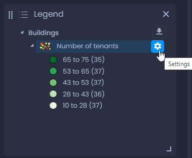
Legend options are specific for each thematic analysis type, but the settings interface is similar :
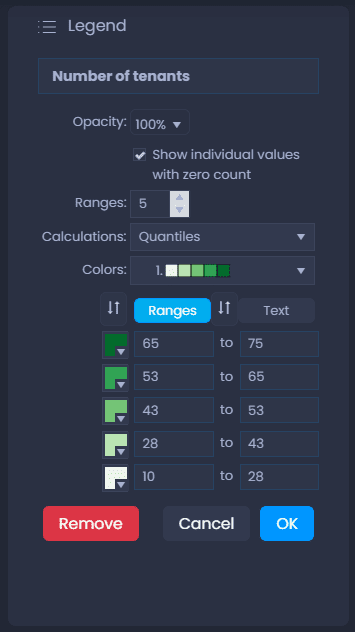
Here are the main options in the menu:
-
Click on the name of your thematic analysis to enter a new name
-
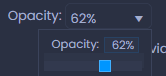
Change your layer’s opacity
-
Drag and drop the handles of a category to change the legend order :

-
Click on the colour

, pattern

, or symbol

of an entry to change it
-
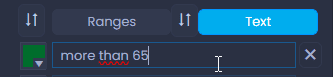
Click on the name of a legend entry to change it. For graduated thematic analysis, click on Text to change the display label of a range.
or

-
Click

to restore the default text for the legend item.
-
Click

to save your changes, and

to discard.
-
Click

to delete your thematic analysis.
Save your thematic analysis
When your thematic analysis has been created, you enter the slide edit mode automatically. You can see it with the green outer line that shows you what will be saved in the slide, with the save menu and with the green slide button.
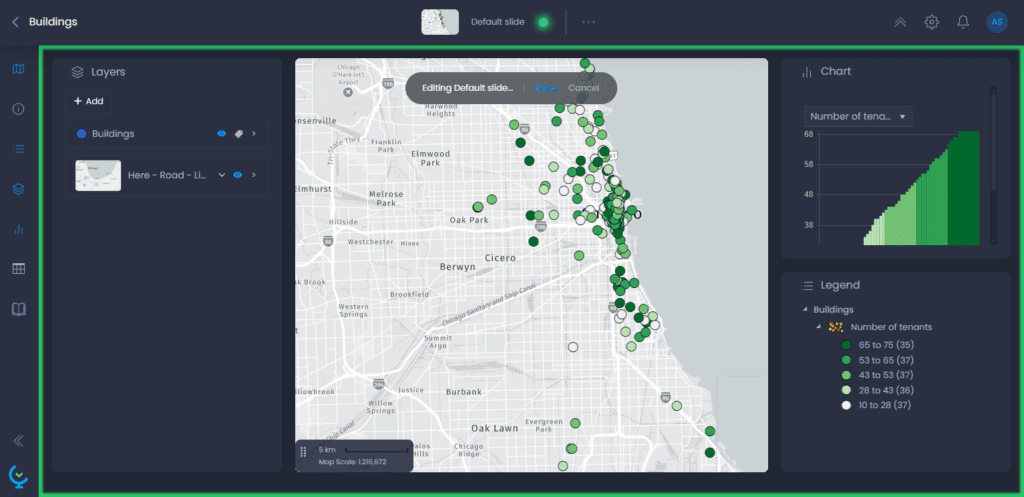
After having customized your thematic analysis via the legend settings, click on “Save” or on the green slide button to save your changes. Please note that all other slide elements will be saved: map extent, panel layout, story, and table view columns.

You can also rename your slide before saving it:

Create multiple thematic analyses
You can create multiple thematic analyses in the same slide, or in different slides.
Multiple thematic analyses in the same slide
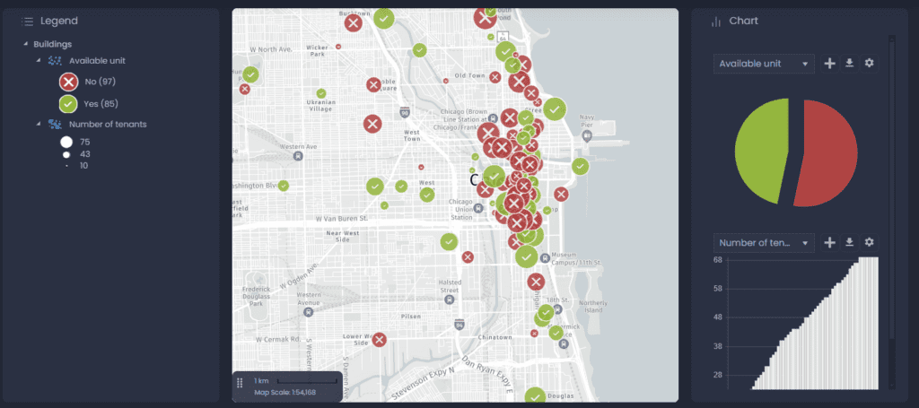
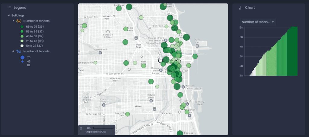
You can stack multiple thematic analyses on the same layer to create advanced data visualization and show different information on your data on the same view: color, size and symbol (or patterns) can be stacked.
You can use size and color to represent different information.
Or you can combine different ways of presenting one information to highlight it:
Multiple slides for different thematic analysis
Some thematic analyses cannot be stacked: if there is already a thematic analysis by color on your layer, creating another one will replace it. To avoid this, you can create a second slide to create your second thematic analysis. Your end users will be able to navigate from one slide to another and see the different color thematic analyses.