

You can use the Grid Analysis / Profile tool to draw a line on a grid layer and generate the profile chart of the grid layer along this line. You can also draw an area to generate a chart of the grid values in this area.
Enable the Grid Analysis / Profile tool
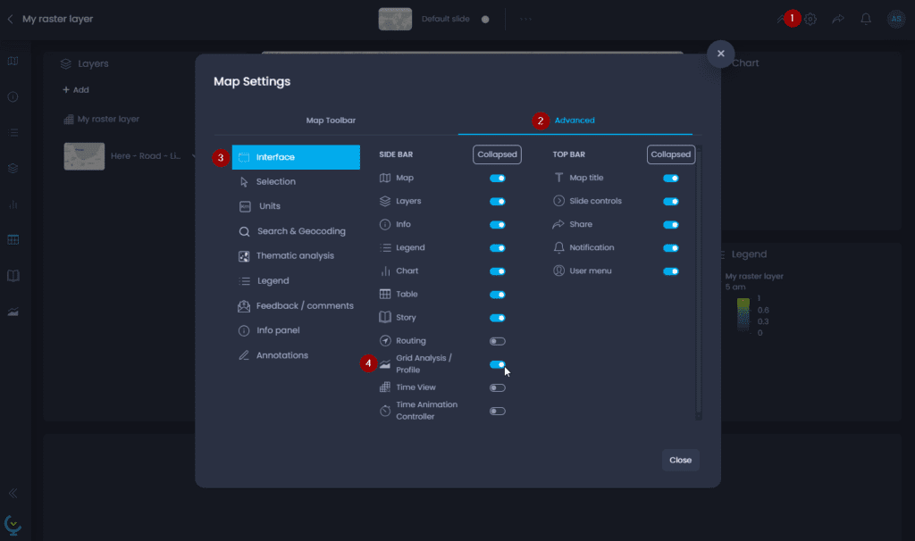
By default, the Grid Analysis / Profile tool is not enabled. A Map Creator with edit permissions on the map can enable it:
- Open the Map Settings
- Navigate to the “Advanced” tab
- Navigate to the “Interface” section
- Enable the “Grid Analysis / Profile” tool
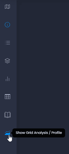
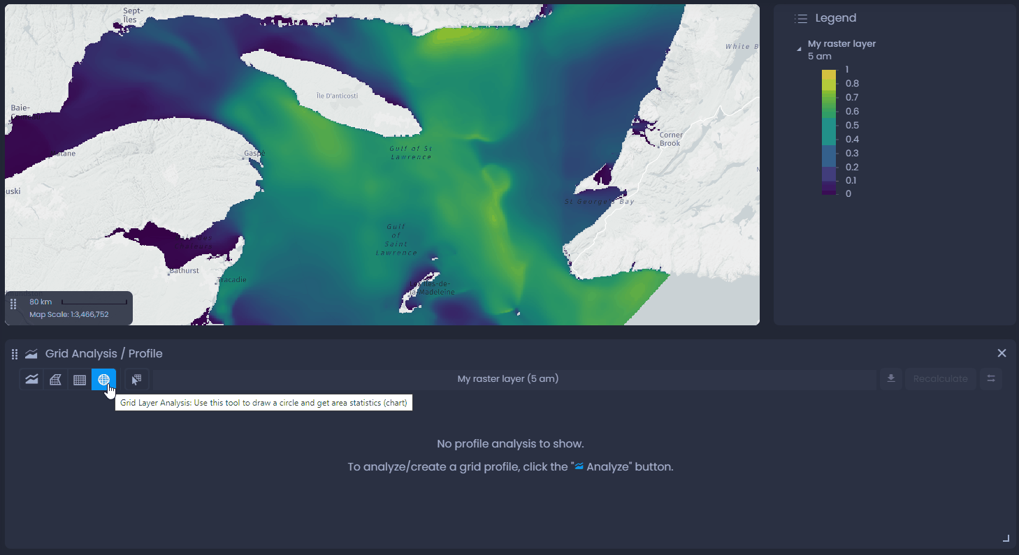
The Grid Analysis / Profile tool is now enabled in the map, and can be opened from the left panel bar:
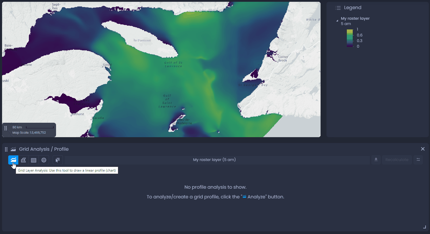
In the default CartoVista layout, the Grid analysis / Profile panel will be below the Data panel. You can close the Data panel or reorganize the panel layout to make the Grid Analysis / Profile panel more visible.
Use the Grid Analysis / Profile tool
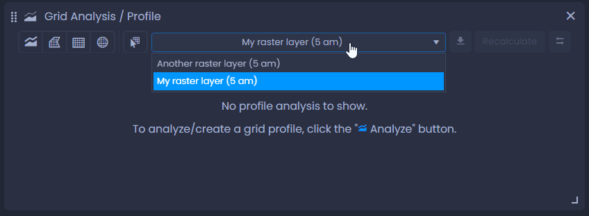
If your map has multiple grid layers, use the list of layers to select the layer you want to analyze:
Draw a profile
To draw a profile, select the line tool in the Grid Analysis / Profile panel

, and draw on the map. Click on the map to add the first vertice of the line, and click again to add another vertice. As you draw, you will see the total line length (“Total”) and the current segment’s length (“Distance”). Double-click to add the last vertice and finalize the line. The chart will be loaded in the Grid Analysis / Profile panel:
Place your cursor on the chart to see the detailed value. You will see the location of the cursor on the map as well. Use

to export the chart in an image or Excel file. Use

to swap the direction of the grid profile.
Draw an area
To draw an area, select one of the area tools in the Grid Analysis / Profile panel

, and draw on the map.
- Free-form polygon: click on the map to add the first vertice of the polygon, and click again to add another vertice. As you draw, you will see the perimeter and the area of the polygon. Double-click to add the last vertice and finalize the polygon.
- Rectangle area: click on your map to place the corner of your rectangle and move your cursor to draw the rectangle. As you draw, you will see the Perimeter and the Area of your rectangle. Click again to place the opposite corner and finalize the rectangle.
- Ellipse area: click on your map to place the center of your ellipse and move your cursor to draw the ellipse. As you draw, you will see the Perimeter and the Area of your ellipse. Click again to finalize the ellipse.
The chart will be loaded in the Grid Analysis / Profile panel:
Place your cursor on of the bar of the bar chart to highlight the matching grid pixels on the map. Use
to export the chart in an image or Excel file.
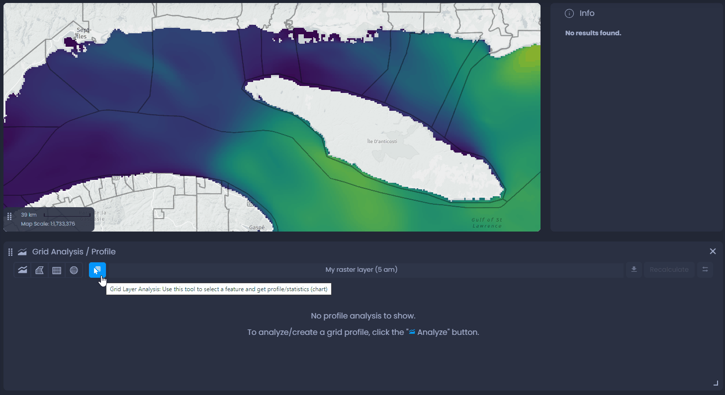
Select an existing feature
You can also create a profile or a chart using a map vector feature. Select the feature selection tool

and click on the feature on the map. The chart will be loaded in the Grid Analysis / Profile panel:
Place your cursor on of the bar of the bar chart to highlight the matching grid pixels on the map. Use
to export the chart in an image or Excel file.
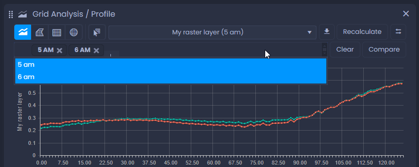
Use the Grid Analysis / Profile tool with time-based data
If your grid layer has multiple time records, you can also use the Grid Analysis / Profile tool to analyze it.
After drawing a profile, you can compare the different time records. Use the time records list to select the time records to be compared, then click

. Each line shows the values of a time record.
Click

to clear your time record selection.
When drawing an area, change the time record displayed on the map then click

to re-generate the bar chart with the new time record.
To learn more on how to work with time-based data, see our dedicated article.