
Link your time-based tabular data to your geospatial data with a many-to-one join, and use specific map tools to visualize and analyze your time-based data.
Link your tabular data to a layer with a many-to-one join
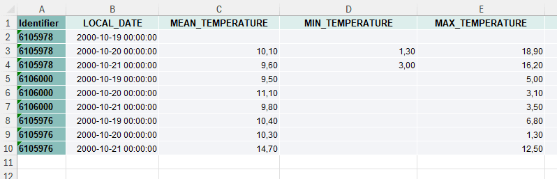
To create a time-based map with vector data, you need two datasets:
- a layer created from a GIS file or a point layer created from an Excel or CSV file using lat/long or address information. Please refer to the linked articles on how to create layers. This layer needs to have a column with a unique identifier
- a tabular dataset (in Excel or CSV) with multiple rows per feature, each row referring to a specific timestamp. This tabular dataset needs to have a column with the same identifiers as the layer and a column with date-time information. The date-time data needs to be
YYYY-MM-DD hh:mm:ss.
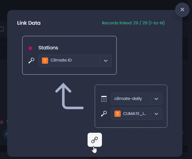
These two datasets then need to be joined on the platform. Please refer to this article on how to link two datasets with a common identifier. You will see that the one-to-many join is indicated in the top right-hand-side corner of the linking dialogue if the two datasets are already imported to your workspace, with the 1-to-N indication:
Finally, the time series column of the tabular dataset needs to be set:
-
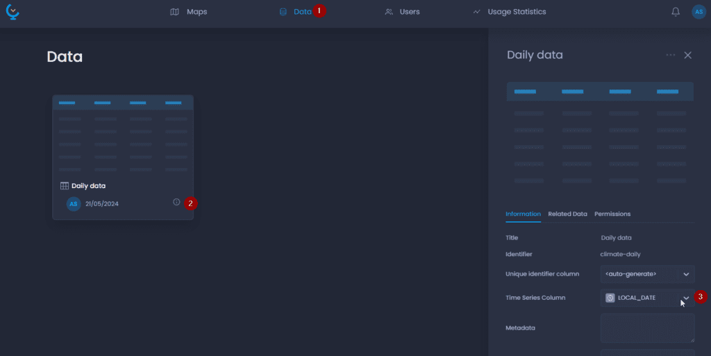
Navigate to your data table in the Data Gallery
-
Click on its name or the

to open the detail panel
-
Set the Time Series Column
Navigate a map with time-based data
Get summarized and individual information on each feature
Time-based data is represented in the map to allow you to see the individual time records as well as an aggregation of these time-based records for each point, polygon, or line.
Thematics are an aggregated view of the time series. Based on the aggregation method that is applied on the map, you get to see either the sum, maximum, minimum, or average value for each point, polygon, or line.
The data tip and data table also display the aggregated value.
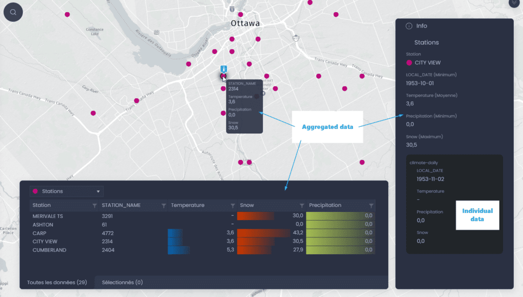
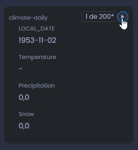
The info tool allows you to get the individual information as well as the aggregated value. Use one of the info tool

or

to click on a feature of the map. The info panel will first show the aggregated values. You can see the aggregation method in brackets. The individual values are displayed in the sub-section. You can go from one time record to another using the arrows in the top right-hand corner of the sub-section.
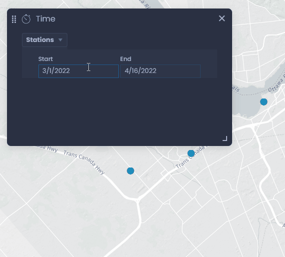
Time Control
The Animation Controller allows you to filter data within a certain period.
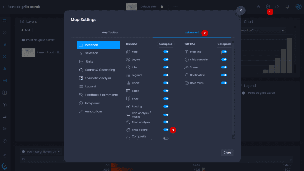
- Open the map settings to add the Time Control panel
- Go to the Advanced settings
- In the Interface tab, enable the Time Control.
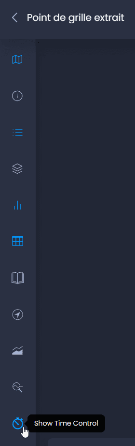
The Time Animation Controller is now available in the left bar. Click on the icon to show the Time Control:
The filter will impact what you see on the map, the data table view, and the information tool. Each aggregated value will be computed based on the period you have selected.
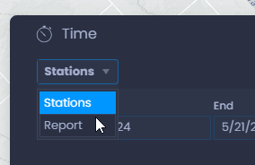
Use the dropdown menu to select your layer if you have multiple time-base layers:
Use the date picker to select a start and end date:
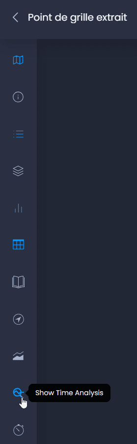
Time Analysis tool
The time view tool allows you to create time-based chart by clicking on a feature on the map.
- Open the map settings to add the Time Analysis panel
- Go to the Advanced settings
- In the Interface tab, enable the Time Analysis tool.

The Time View tool is now available in the left bar. Click on the icon to show the Time Analysis tool:
-
Click on a map feature with the Pan and Info tool
or the Info tool
to view its time chart
-
Select the column to be viewed using the column dropdown
-
The time graph will display data for each year, month or day, based on the period that has been selected. You can click on a year, month or day to see the precise evolution for this period. You can navigate through time this way. Click on this icon

to go back to the initial chart view.
-
You can also switch to display individual values by clicking on

and then go back to aggregated values using

.
Note that if you have a thematic analysis on one of the time-based columns, the colors will be applied in the chart when viewing this column in the Time Analysis tool.